Case study — Plant shop & garden café
Verde & Vine
A plant shop that reads like a seed catalogue
- Vertical
- Plant shop & garden café
- Year
- 2026
- Tier
- Studio
- Pages
- 4
Demonstration build
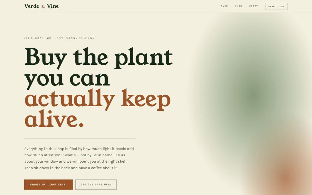
The whole site is live. Go and click around.
01 — The brief
What the client came in with.
Two businesses share one roof: a plant shop and a small café. The old site treated them as separate worlds and visitors could never tell whether they were allowed to just sit down with a coffee.
Staff were answering the same three questions on the phone all day — is this plant hard to keep alive, does it survive a north-facing window, and are you open on Sundays.
02 — The approach
Three decisions that shaped the build.
- 01
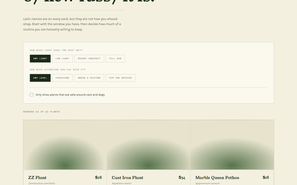
Catalogue structured around care, not species
Every plant is filed by light requirement and difficulty first, Latin name second. The browse page leads with 'thrives in low light' rather than a taxonomy a customer has to translate.
- 02
One roof, one navigation
Shop and café sit side by side in the nav with a shared visual language, so the site reads as a single place you can spend an afternoon in.
- 03
Editorial serif, generous measure
A high-contrast serif and a wide text measure give the catalogue the feel of a printed seed guide — the reference the owners kept coming back to.
03 — Identity system
Typography
- Display
- Young Serif
- Body
- Karla
Young Serif has the chunky, slightly agricultural warmth of a printed seed guide; Karla keeps the care instructions legible at small sizes.
Palette
Deep Forest
oklch(32% 0.062 150)
Moss
oklch(52% 0.085 143)
Cream
oklch(95.5% 0.025 92)
Terracotta
oklch(62% 0.13 46)
Built
- Filterable catalogue with light and difficulty facets
- Care-guide panel on every plant card
- Café menu with daily bake listing
- Workshop schedule with capacity indicators
- Visit page with hours, parking and transit notes
04 — The build, by the numbers
- Pages built
- 4Pages built
- Catalogue entries
- 12Catalogue entries
- Images required
- 0Images required