Case study — Strength & conditioning gym
Northside Barbell
No mirrors, no excuses, no soft shadows
- Vertical
- Strength & conditioning gym
- Year
- 2026
- Tier
- Studio
- Pages
- 4
Demonstration build
The whole site is live. Go and click around.
01 — The brief
What the client came in with.
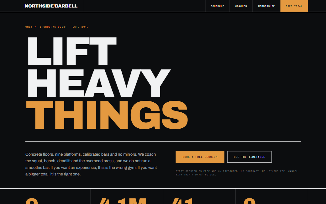
The gym's identity is deliberately severe: concrete floors, chalk, no mirrors. The previous site looked like a wellness spa and was attracting the wrong enquiries entirely.
Members check the class schedule on a phone, mid-session, sweating. Legibility at a glance mattered more than anything decorative.
02 — The approach
Three decisions that shaped the build.
- 01
Brutalism as an accurate description
Hard 1px rules, zero border radius, no shadows, safety-orange on near-black. The design is severe because the gym is severe — it filters enquiries before anyone picks up the phone.
- 02
Schedule built for a sweaty thumb
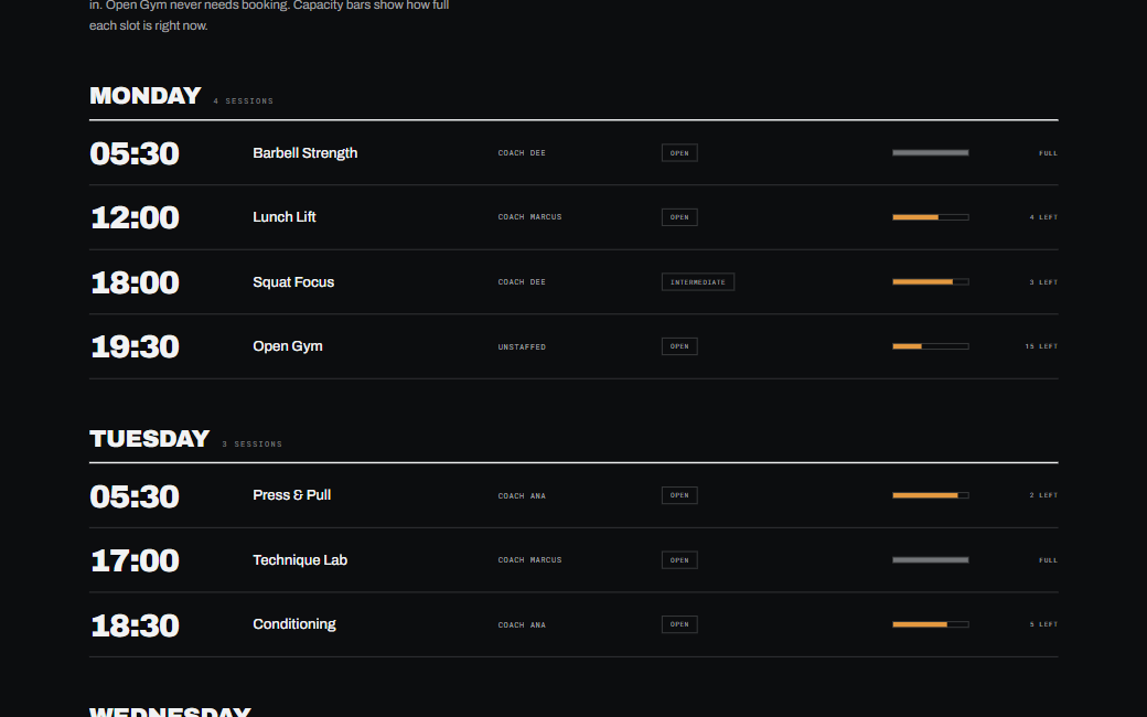
The weekly timetable is a single scannable table with oversized numerals, 48px touch targets, and capacity shown as a filled bar rather than a number you have to interpret.
- 03
Numbers as the dominant visual
Total tonnage lifted, coach certifications, session counts. Condensed display numerals at display sizes carry the whole page — no stock gym photography anywhere.
03 — Identity system
Typography
- Display
- Archivo Black
- Body
- Archivo
One family, two extremes of weight. The monospaced metadata labels come from JetBrains Mono to reinforce the engineered, utilitarian register.
Palette
Pitch
oklch(16% 0.004 250)
Safety Orange
oklch(68% 0.192 48)
Concrete
oklch(72% 0.006 250)
Chalk
oklch(96% 0.002 250)
Built
- Weekly class timetable with capacity bars
- Coach roster with certification listings
- Membership comparison with no hidden tiers
- Scrolling marquee of gym records
- Trial-session enquiry form
04 — The build, by the numbers
- Pages built
- 4Pages built
- Timetable slots
- 28Timetable slots
- Contrast on orange
- AAContrast on orange