Case study — Family dental practice
Meridian Dental
Built for the most anxious person who will ever visit
- Vertical
- Family dental practice
- Year
- 2026
- Tier
- Studio
- Pages
- 4
Demonstration build
The whole site is live. Go and click around.
01 — The brief
What the client came in with.
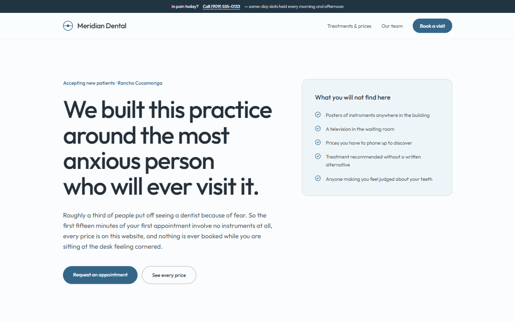
Roughly a third of patients delay appointments out of anxiety. The old site's stock imagery of gleaming instruments was actively making that worse.
Patients could not find out what anything cost, so the front desk fielded price questions all day and new patients went elsewhere.
02 — The approach
Three decisions that shaped the build.
- 01
Anxiety-aware content order
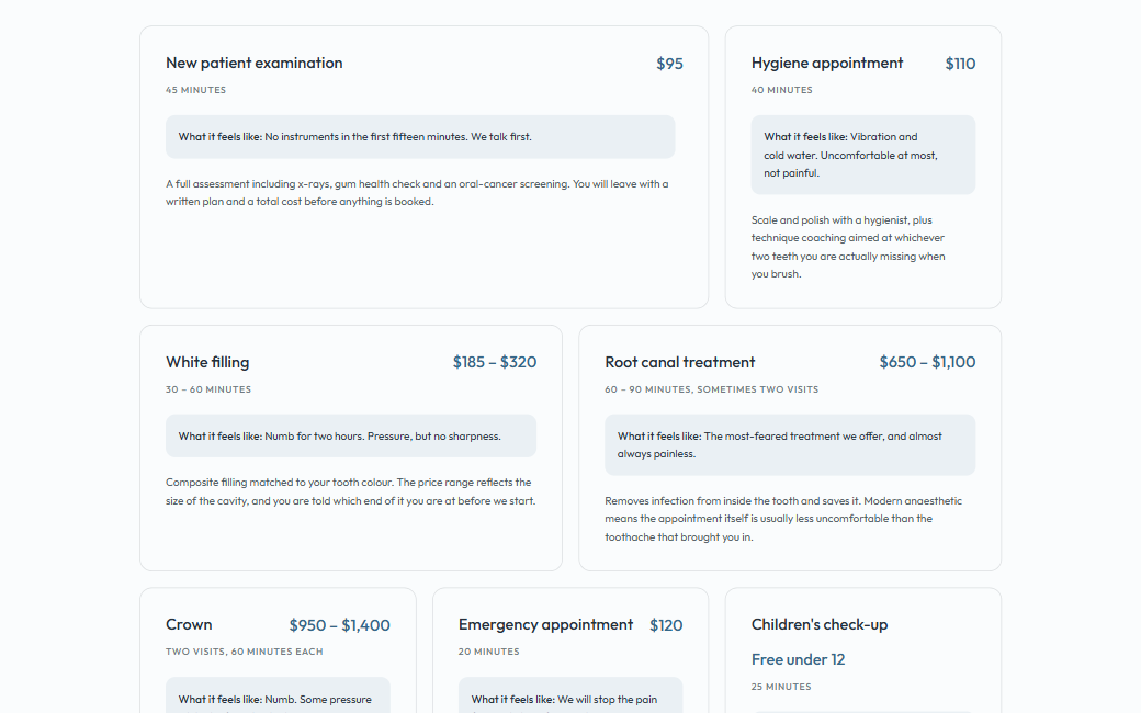
What happens at a first visit comes before credentials or technology. Every procedure page states duration, what you will feel, and the price up front.
- 02
A calm palette and a lot of air
Soft cyan on near-white, generous whitespace, nothing clinical or sharp. The restraint is the design decision — this is the one site in the portfolio that should not shout.
- 03
Accessibility treated as a requirement
A 4.5:1 minimum on every text pairing, full keyboard operability, semantic landmarks throughout, and a booking form that never relies on colour alone to convey state.
03 — Identity system
Typography
- Display
- Outfit
- Body
- Outfit
A single geometric sans across the whole site. In a healthcare context, typographic consistency reads as competence; contrast reads as marketing.
Palette
Meridian Cyan
oklch(58% 0.098 218)
Slate
oklch(38% 0.028 240)
Mist
oklch(96.5% 0.012 215)
Signal Green
oklch(58% 0.112 155)
Built
- Bento grid of services with prices stated plainly
- First-visit walkthrough written for anxious patients
- Clinician profiles with qualifications and languages spoken
- Appointment request form with accessible validation
- Insurance and payment-plan explainer
04 — The build, by the numbers
- Pages built
- 4Pages built
- Minimum contrast
- 4.5:1Minimum contrast
- Keyboard operable
- 100%Keyboard operable